


I love seeing the different atmosphere created in these renders by Luca Catino using a variety of PG SKIES. Some amazing details too, click on the thumbs to view bigger.
You can see more of Luca's work at www.luca-catino.com

I love seeing the different atmosphere created in these renders by Luca Catino using a variety of PG SKIES. Some amazing details too, click on the thumbs to view bigger.
You can see more of Luca's work at www.luca-catino.com


Some great images brought to my attention recently of Marcio Kogan's Panama House, faithfully recreated by Blackhaus. The dusk shots and the panorama uses the classic dusk PG Skies HDR '2003 Dusk Blue'.

You can download the gearVR images and enjoy the rest of the images on the Blackhaus website.

Another great project spotted on www.ronenbekerman.com, this time by Giona Andreani
Rendered using Corona, but interestingly still using the chaosgroup Phoenix FD ocean texture for the water. Giona used Corona sun for the day shot, and my 1941 HDRi sky for the blue image and 2003 for the b&w.
Bastiaan Couperus (hdri 2003 dusk blue)
Very impressed with the finished work from the latest State of Art Academy Masterclass. This is just a selection but please take a look at the write up on the SOA website here.
Congratulations to all of the students, I thought the images were very strong, atmospheric, well composed, and told a story.
Of particular interest to me is that they all use my HDRi skies. I like to think that I can often spot which ones are used, but the truth is it's not at all easy. You can find links to the skies used at the bottom of this post.
Some info from Gianpiero about the masterclass and the process they go through:
"The project we used for the masterclass as case history was the Sea View House from Jackson Clements Burrows Architects
We created the images with 3dsmax, V-ray, Forest Pack, Railclone and Photoshop after 3,5 weeks of intensive teaching.
The Masterclass is the most complete course here at SOA Academy. We train people for all the production stages and then we push them to develop their own style and point of view."
Loik Eyers (hdri 1103 Sun Clouds)
Lene Martinussesn (hdri 1103 Sun Clouds)
Adrian Cardenas (hdri 2009 dusk pink)
Miguel Mendes (hdri 2003 dusk blue)
Skies used: 1103, 2003, 2009
Spotted on www.ronenbekerman.com yesterday, two brilliant renders by Héctor Javier Diez Valladares.
Head over to Ronen's blog for the full making of, I just wanted to showcase it here as Héctor used the classic* 1941 dusk sky.
* even if I do say so myself...
Sky used: 1941
(click image)
Mind boggling. I suspect these may find their way into any kitchen renders I do from now on.
Read more on Bertrand's blog or buy them on his turbosquid page.
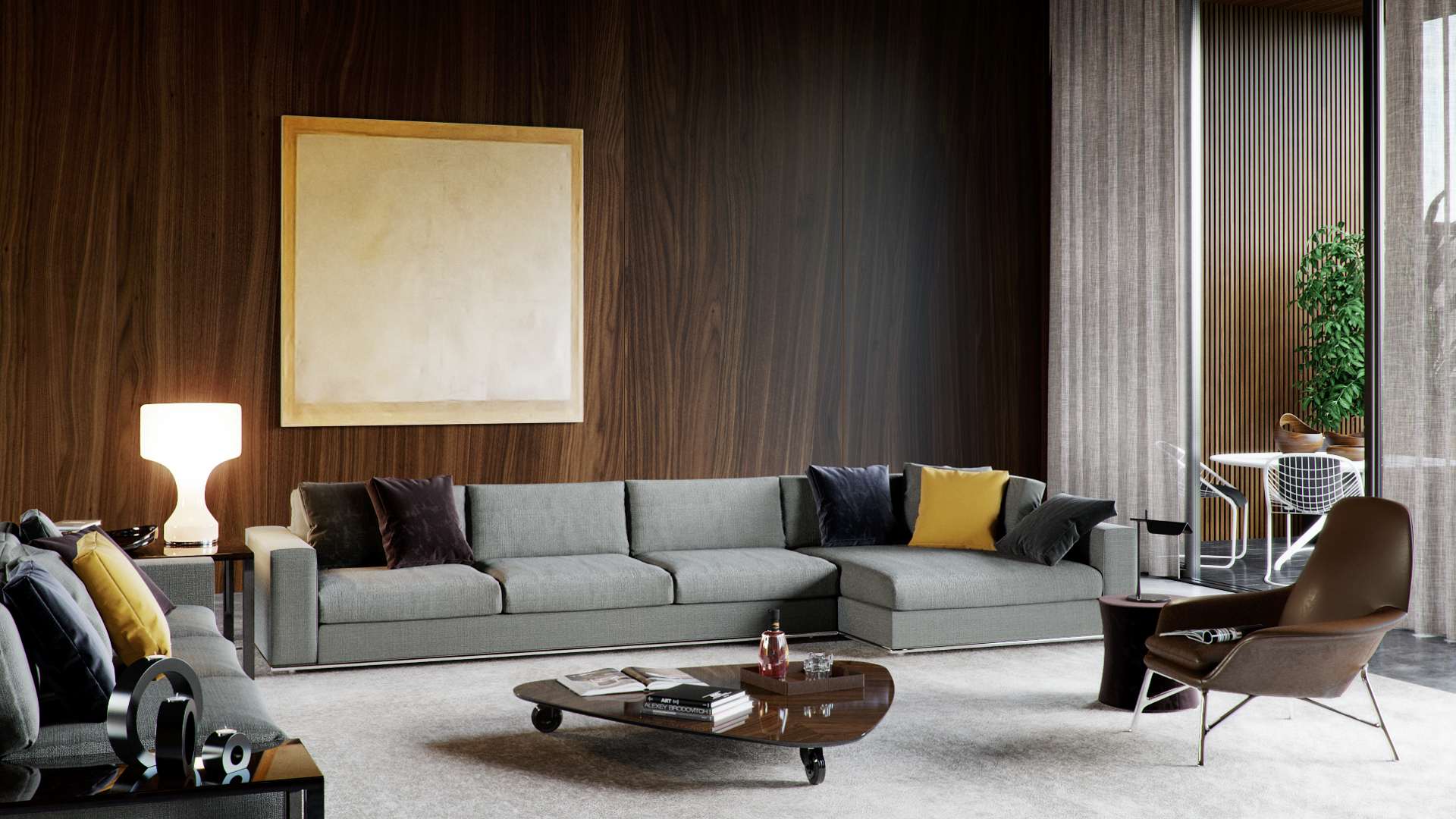
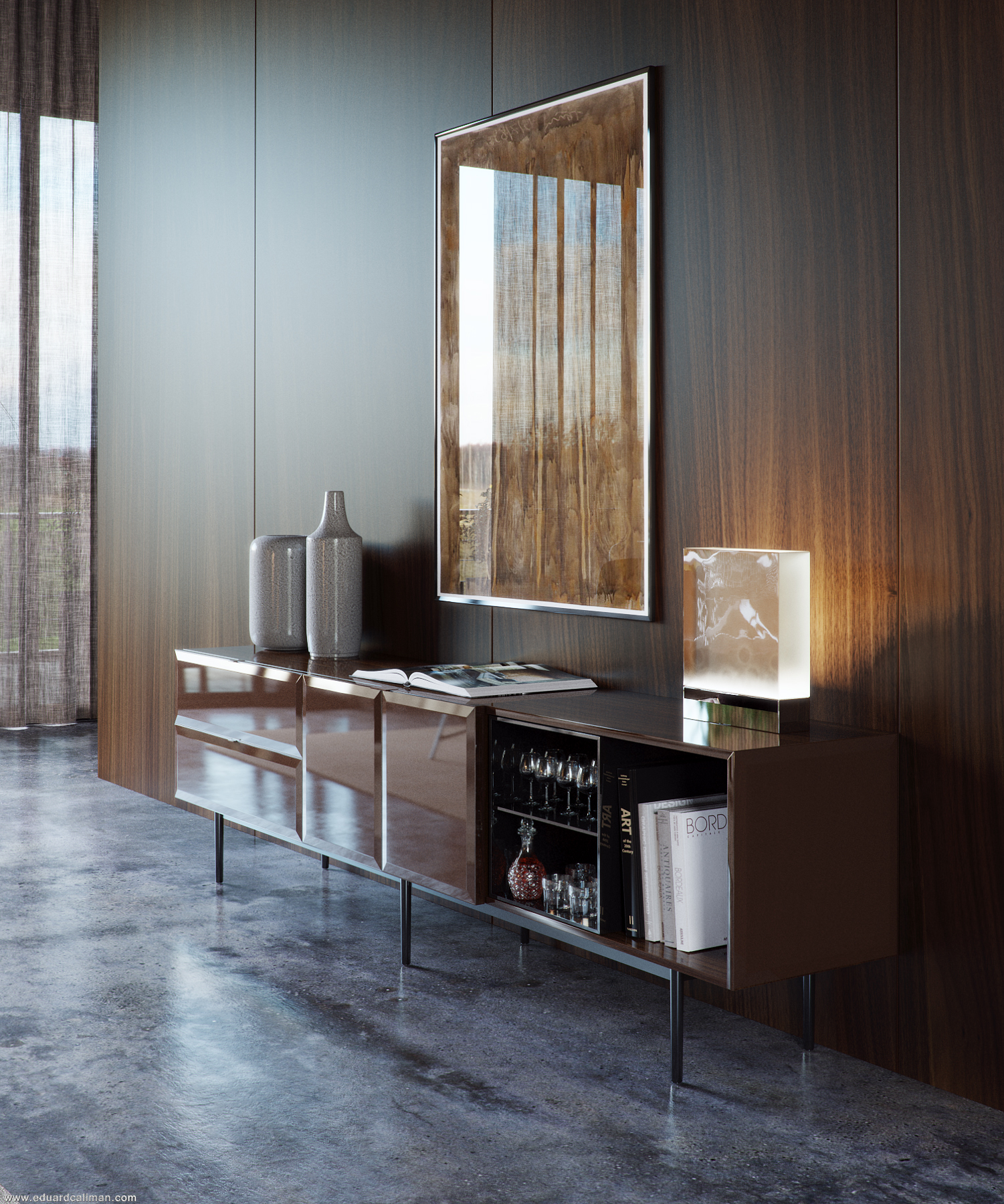
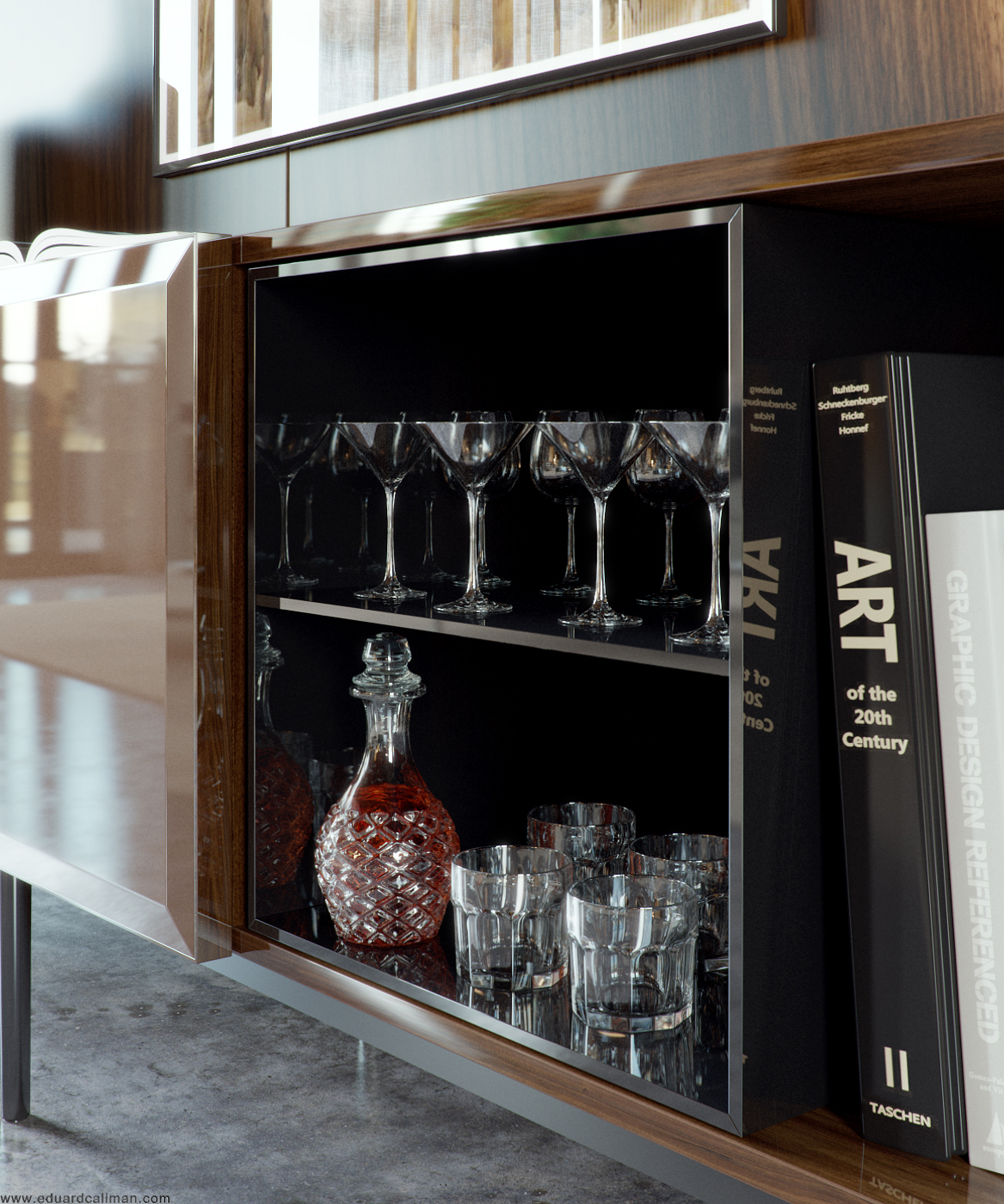
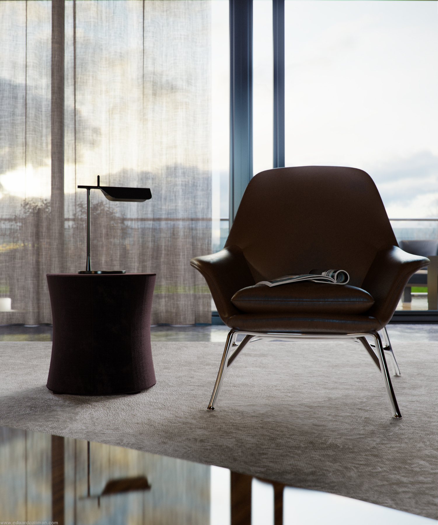
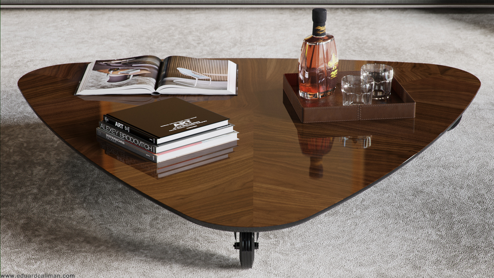
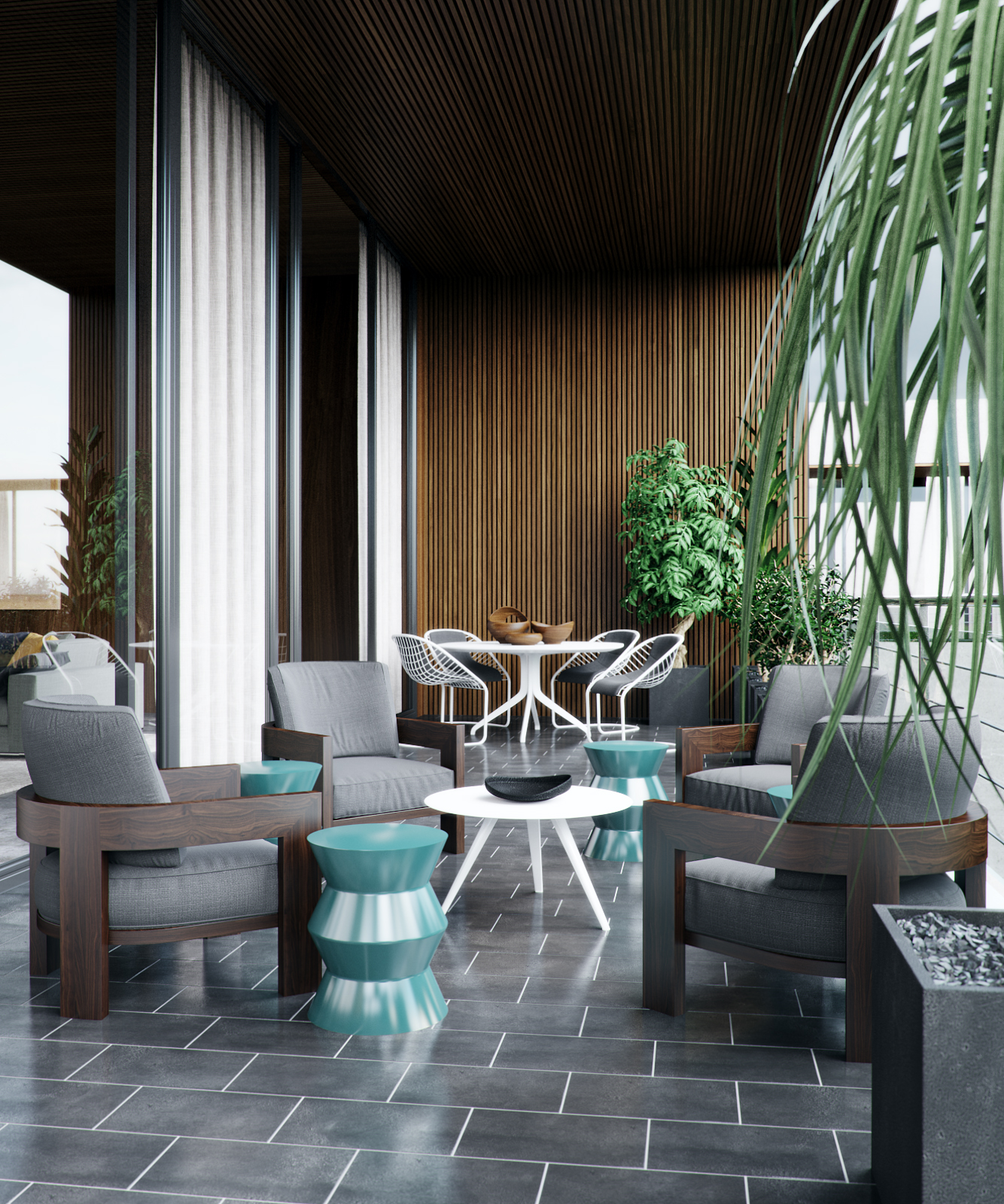
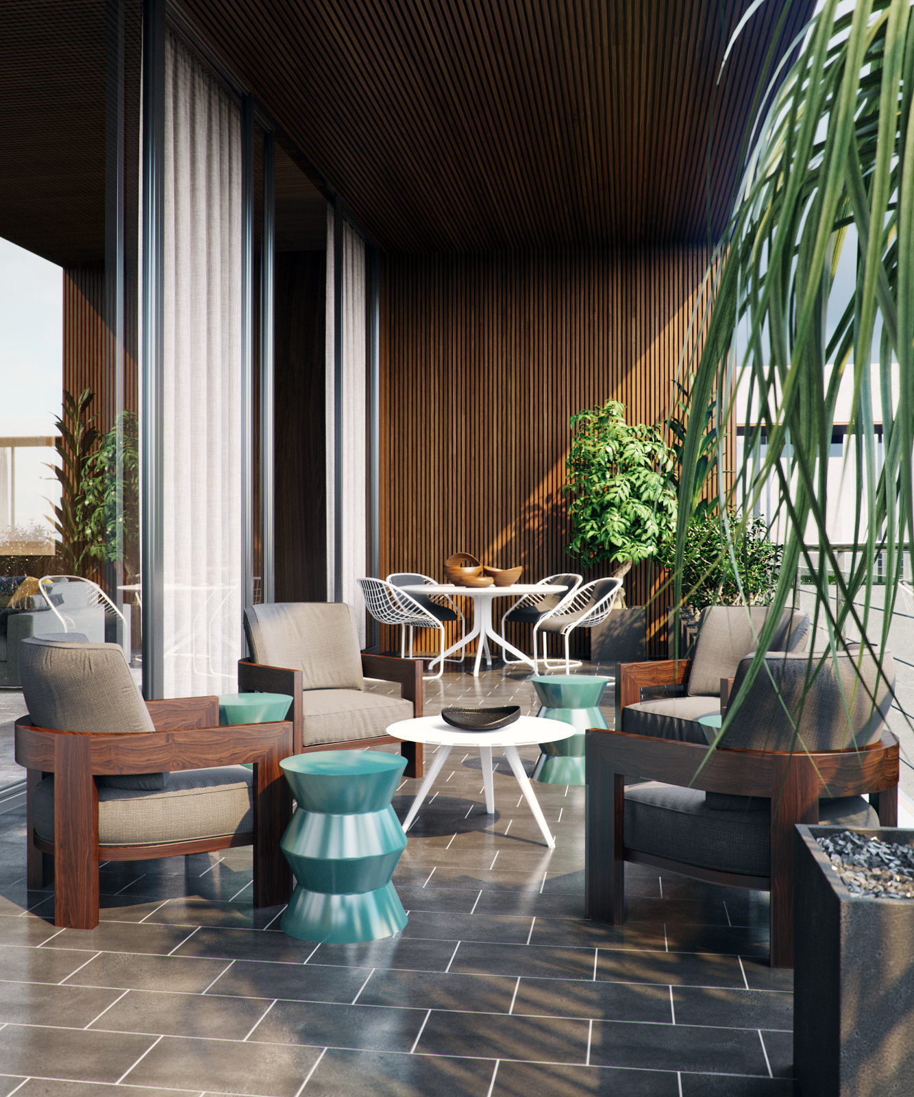
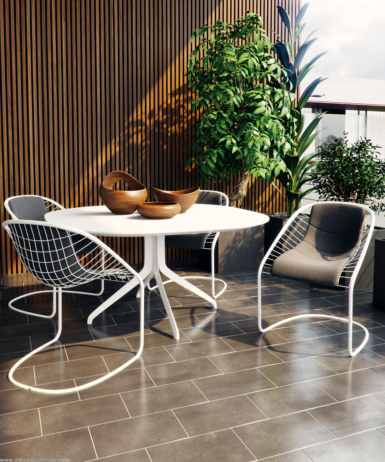
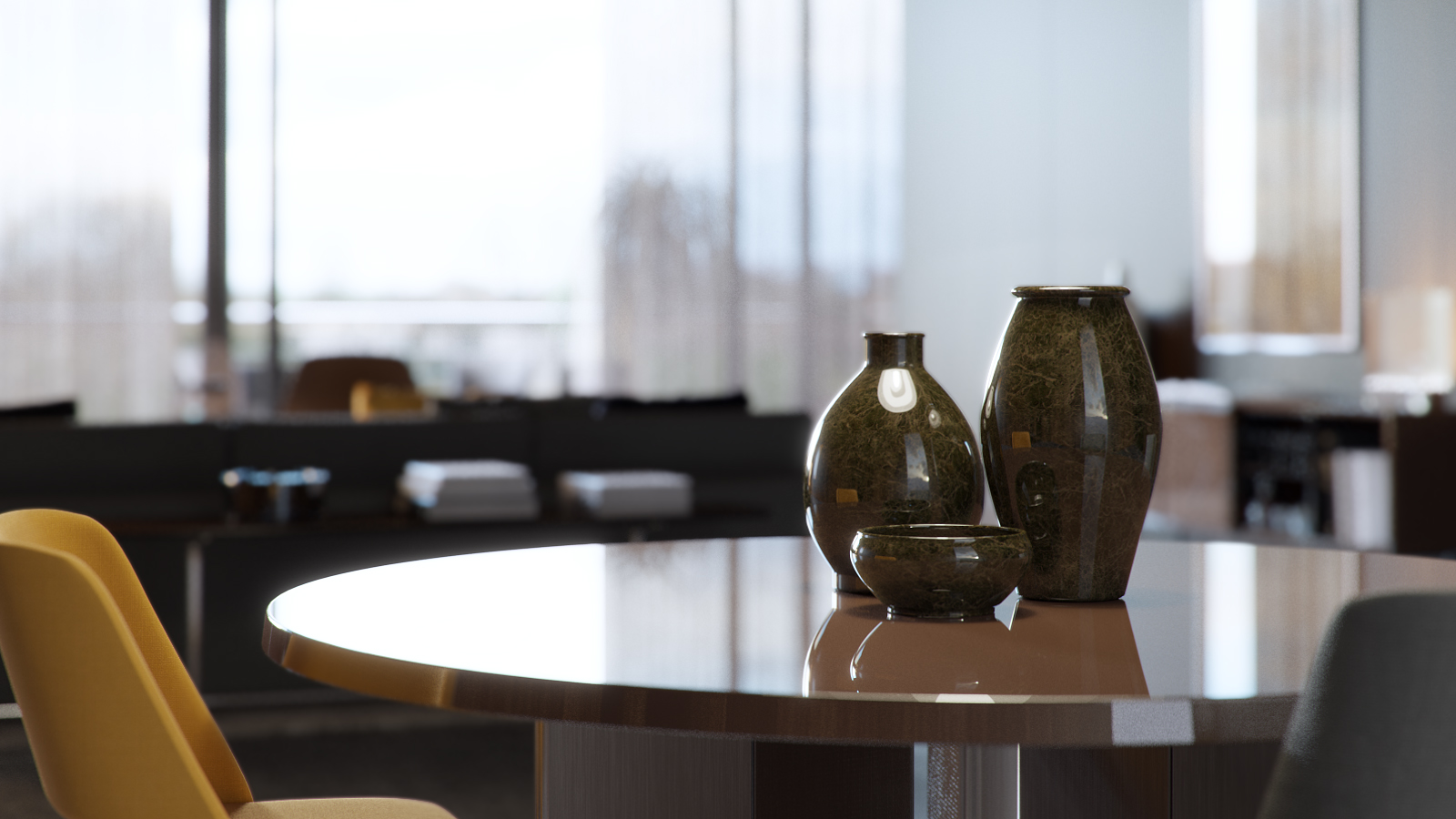
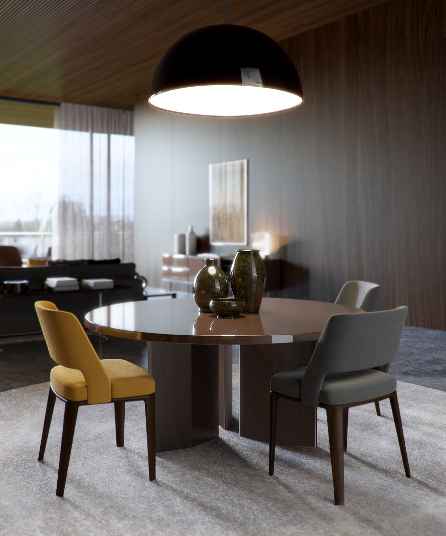
These renders by Eduard Caliman caught my eye recently. A very sophisticated look which is hard to pull off. Great lighting and materials and all done in Corona Renderer which makes it extra interesting for me.
Here are a few notes from Eduard on how he did it:
After I had decided upon and set up the initial space I added temporary placeholders which allowed me to have a bit of detail when testing the lighting. I always like to have visibly some nice results when doing tests, that way I am compelled and inspired to keep on going with the project and also that is why I usually take care of the lighting and materials at an early stage.
Lighting
I knew from the get go that I wanted an overcast feel to the interior, and that is why I chose one of Peter Guthrie's great set of HDRIs. For this particular project I chose the 1313 Cloudy HDRI which worked out perfectly, I only fiddled a bit with the rotation of it just to get the shadows as I wanted them to be but as far as illumination quality it was ideal.

For the sunny balcony shots since you don't see too much the sky I kept the same HDRI but added a corona sun and that was it.
he material creation process was quite simple actually and not a lot of complex shaders were created. will say a few words though on the cushion, concrete and rug materials.
Cushion material
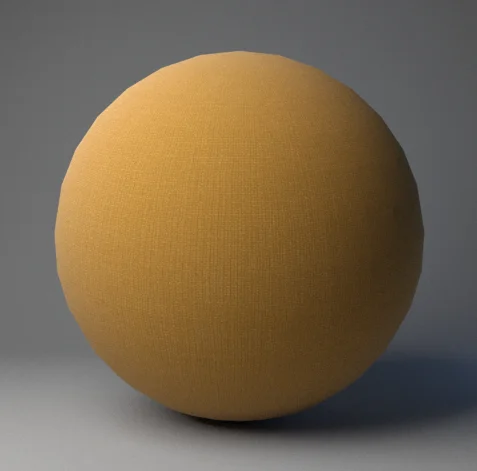
What is more interesting about this shader is the way I used the fallof map. Whenever I create a fabric material I usually do it this way: I plug in the base map in a composite layer, and I duplicate that slot. I will then colour correct the second slot and modify the gamma of that map, I usually raise it to 2/3 depending on the map. This will give me a darker map and a brighter map, I then add a fallof map in the mask of the brighter slot. Now, usually a fabric material has some imperfections on its fallof which is never perfectly shown; that is why I add a map on top of the fallof to show or hide some of the fallof effect, in the screenshot I will post below you can see that I have used that particular map in screen mode (3% opacity) to do just that, to use the brighter values of the map to add some brighter spots on other areas of the fabric. Some other times I also use the bump map in multiply mode to remove some of the fallof effect.
Concrete material

To get to the bump map of a texture what I usually do is desaturate the image and then apply a Levels correction similar to the one below. Note how the sliders are placed at the beggining, middle and end of the colour information inside the histogram, that way one creates a texture that is easy to manipulate in 3DS Max using the various blending modes in the Composite map (usually Multiply and/or Screen in my case) as you will see below. A good advice would be not to go over the information in the histogram too much so that you don't clip and lose valuable colour information.


Rug material
A very simple one, the prerequisite here was to have good enough maps. The settings were very simple, bump at 1 and that's it.
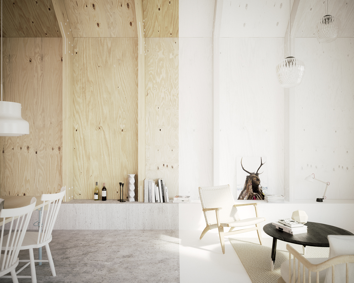
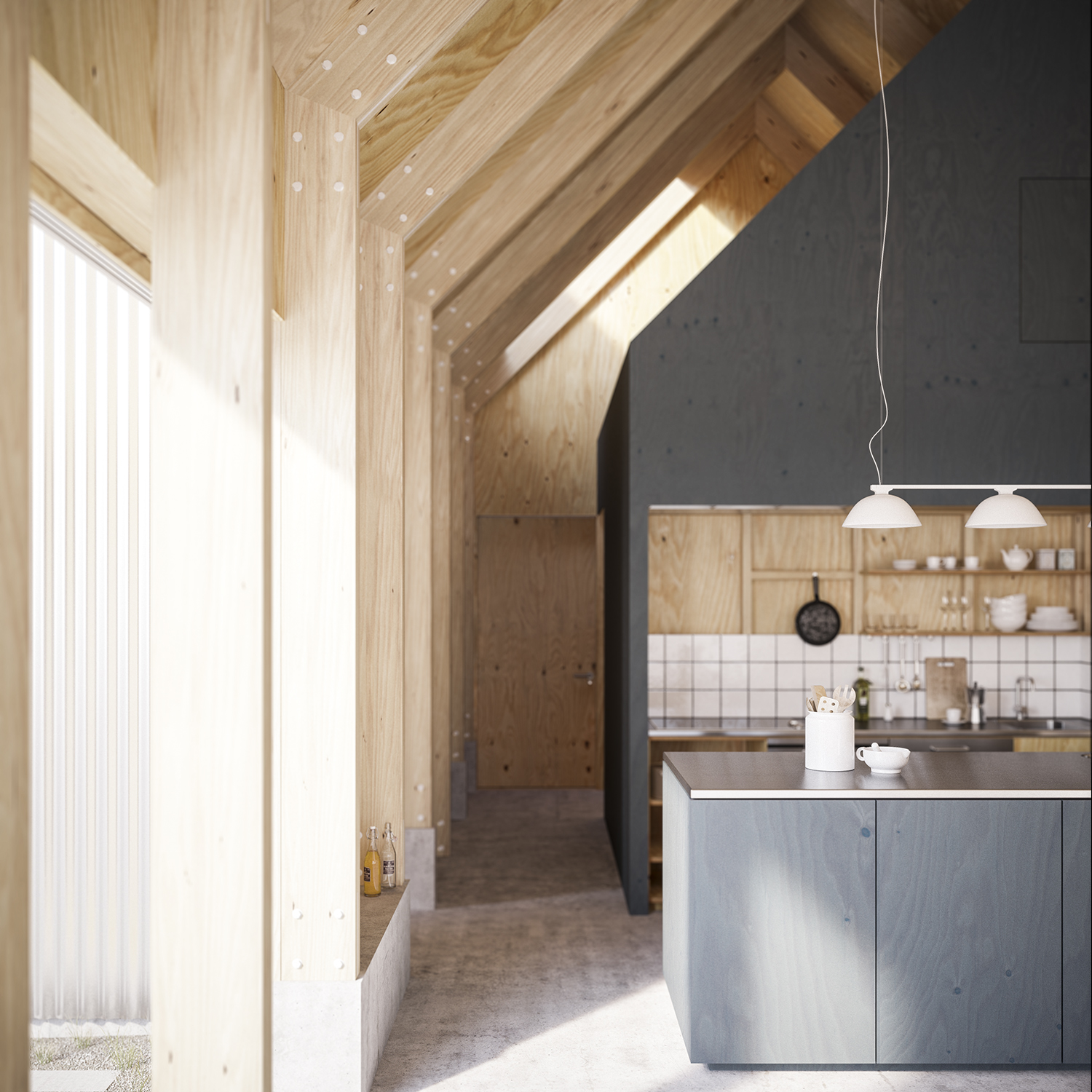
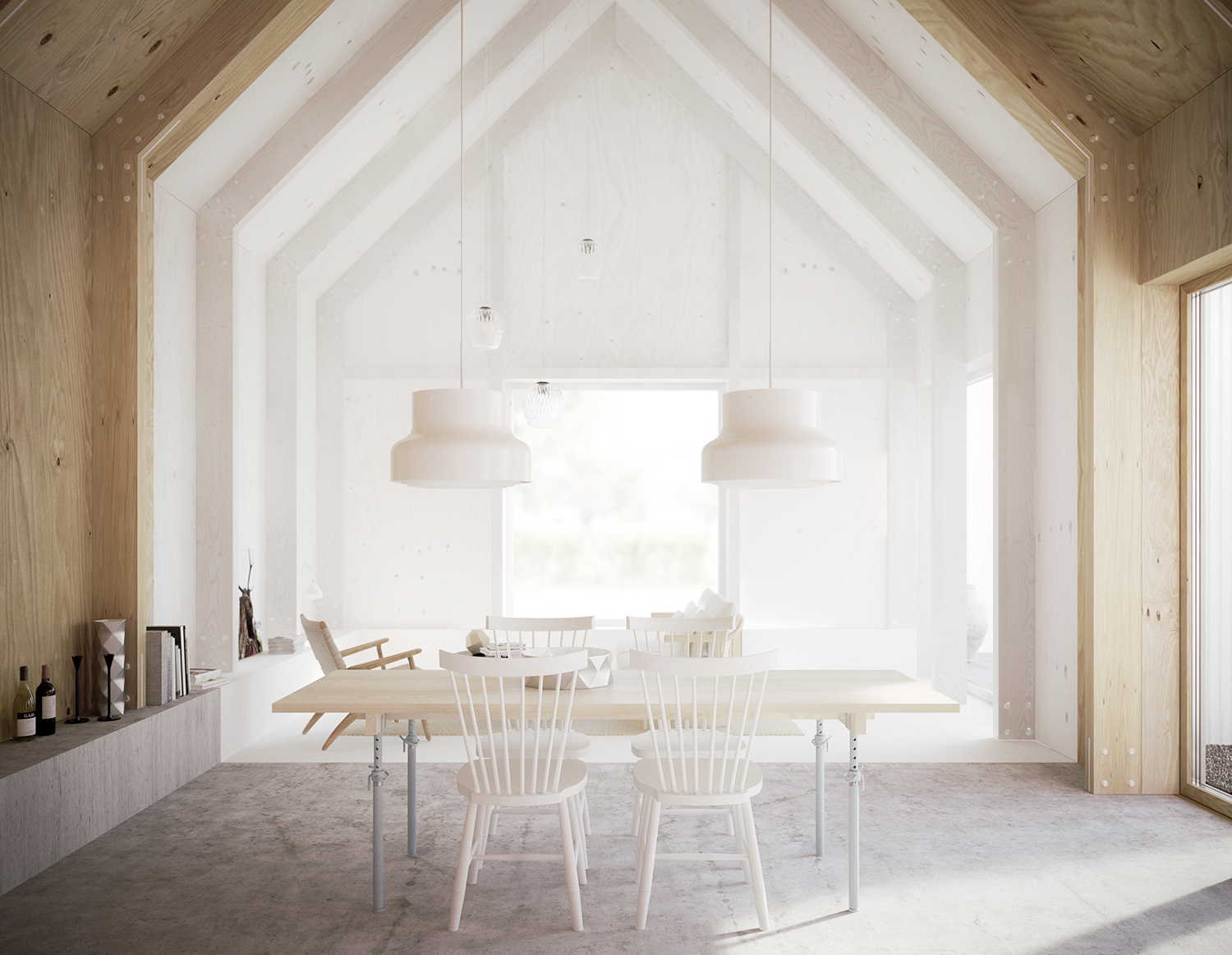
Björn Förstberg of Förstberg Arkitektur sent me some really nice renderings today of a project entitled 'House for mother'. They feature my plywood textures as well as being lit by HDR sky number 1103.
Bertrand's flair with materials and modeling seemed such a good fit with this architectural masterpiece that I had to put aside my own ambitions to do a visualisation study of it and see what he would come up with. Not disappointed! Really must find some time to do a personal project again!
This is just a small selection of images, have a look at Bertrand's blog for the full set, and if you are interested in the building, Ronen found a couple of nice videos about it.
(love this one as I've never seen photos of this stair, the timber floor material is very cool)
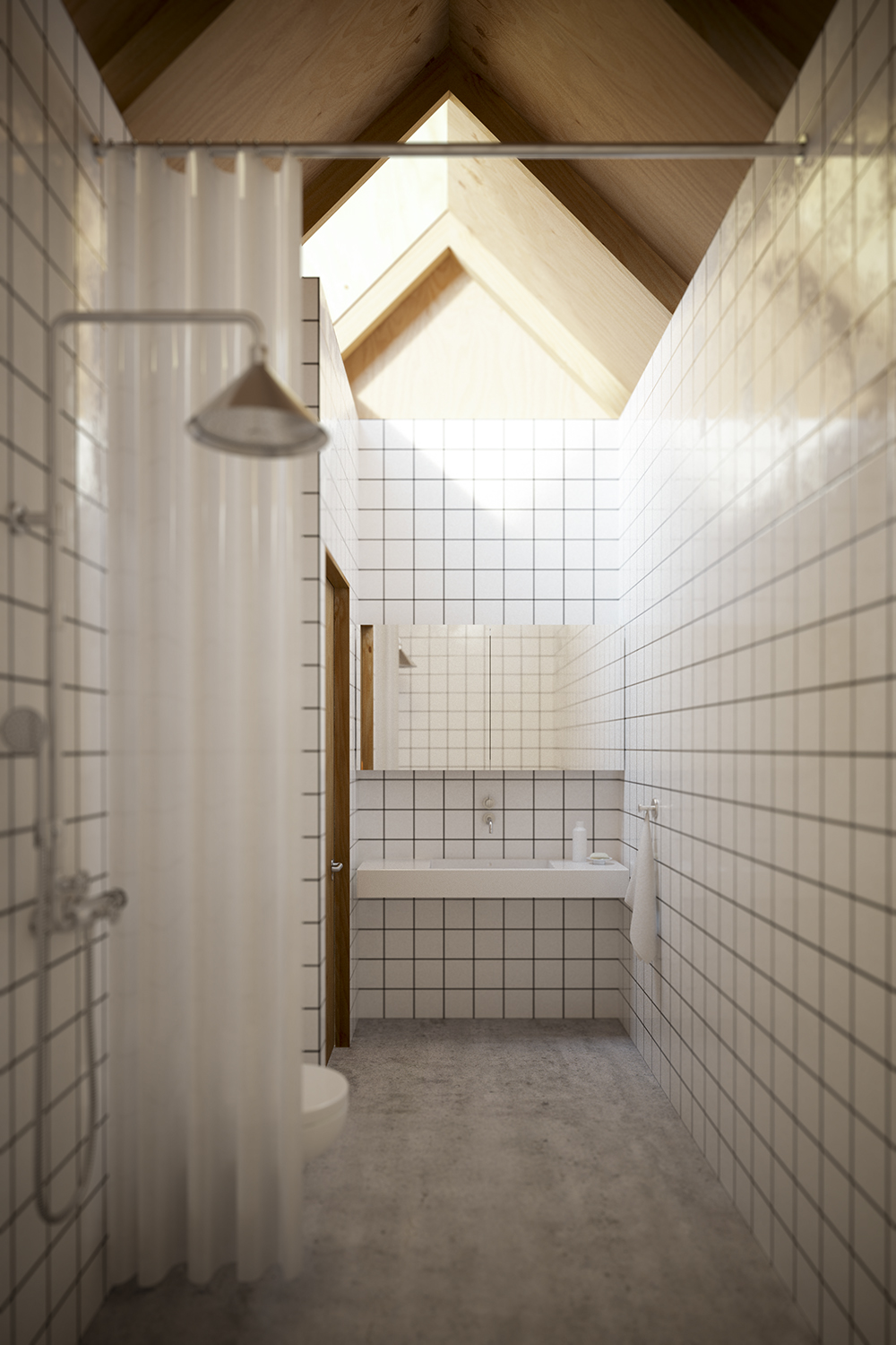
Juraj Talcik from Talcik | Demovicova Studio just published a new set of renders of an Icelandic Coastal House, have a look at the full set on Behance.
Apart from them being beautiful to look at, I'm especially interested in them as he uses Corona Renderer - something I've been playing around with recently. Juraj has agreed to share some tips & tricks for corona beginners here on my blog so keep an eye out for that over the next couple of days.